
Behind the Brand
Wear What You Don't Say: The Story Behind Printz For Zoey
A small gold heart, a name, and one idea: some feelings are easier to wear than to explain. This is where Printz For Zoey began.
June 4, 2026 · 6 min read
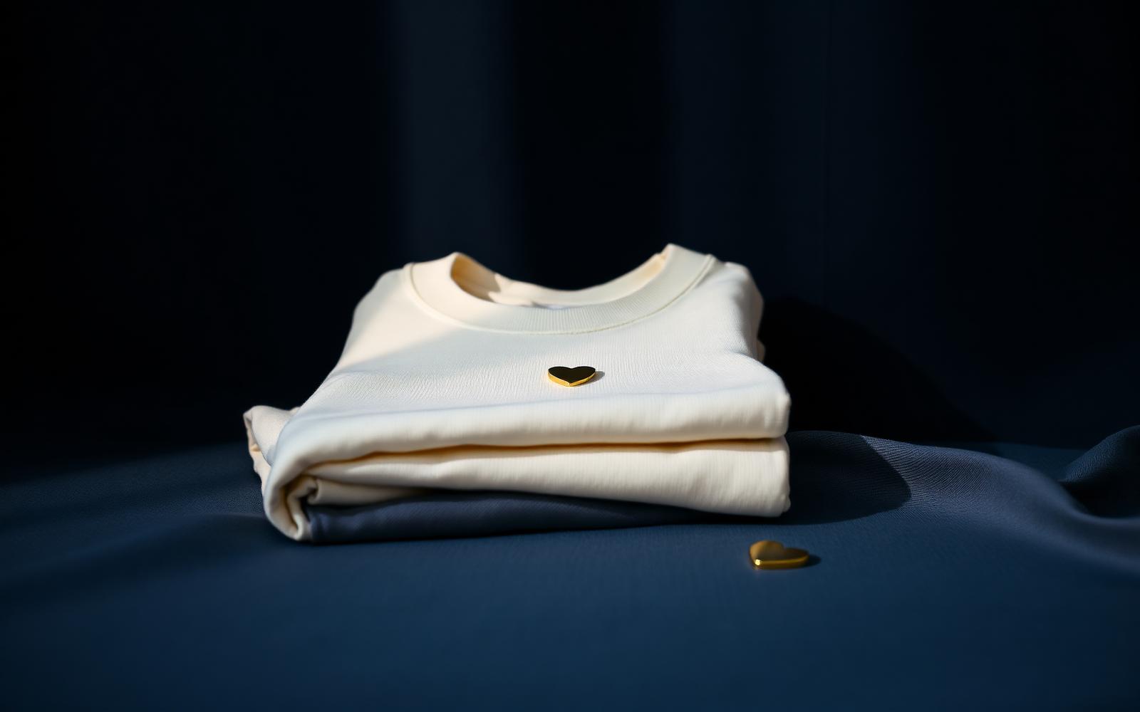
Every brand starts with something small. Ours started with a sentence that never got said out loud. Printz For Zoey was built around a simple observation: the things people feel most deeply are usually the things they say least. Grief, gratitude, love, hope, the slow work of healing — most of it stays inside, folded up, waiting for a better moment that rarely arrives.
We wanted to make something for that in-between space. Not loud slogan merch, and not silence either. Clothing that carries a feeling quietly, in a way the wearer understands first and everyone else understands second.
The name, and the heart that follows it
The wordmark pairs a steady serif with a flowing script that ends in a heart. That detail is not decoration. The serif is the part of us that is composed and presentable; the script is the part that runs ahead of itself. The heart is where the sentence finally lands. Put together, the logo says exactly what the brand does — it starts formal and ends honest.
The standalone heart symbol became our signature mark. You will find it embroidered on caps, foiled onto hangtags, pressed into the gift boxes and tucked inside the neck label of every tee. It is small on purpose. A private signal, not an announcement.
Some feelings are easier to wear than to explain.
Why 'Unspoken Feelings' became a collection
The first pieces we printed were single lines: I felt everything. Still healing. Softer than I look. They were not designed as marketing copy. They were the kinds of sentences people write in notes app drafts at midnight and never send.
What surprised us was how people wore them. Not to make a statement to a room, but as a reminder to themselves. Customers told us they saved a particular hoodie for therapy days, hard anniversaries, long flights home. The clothing had become a small act of self-recognition. That response shaped everything we have made since.
How we design
Three rules guide every piece in the studio:
- Typography before graphics. If a line cannot carry the piece on its own, the piece is not ready.
- Neutrals over noise. Cream, navy, sand and black keep the words in focus and keep each item wearable with what you already own.
- Comfort is part of the message. Heavyweight cotton, soft-brushed fleece interiors and relaxed fits, because a piece you reach for on a hard day has to feel like a hard-day piece.
We print in small runs and refine as we go. A design gets reworked until the letter spacing, the placement on the chest and the weight of the ink all feel calm rather than shouty. It is slower, but it is the only way to make something that still feels right two years later.
The unboxing is part of the message
Because so many of our orders are gifts, we treat packaging as part of the product. Cream boxes and bags, a black hangtag stamped in gold, a jewelry pouch for the smaller items. Nothing plastic, nothing disposable, nothing that undercuts the moment where someone opens a box and realises somebody paid attention.
Made for people who feel a lot
Printz For Zoey is not trying to be for everyone. It is for the friend who remembers dates, the person who cries at commercials, the one who overthinks the text before sending it. If you have ever wanted to say something and put it away instead — this is the wardrobe version of finally saying it.
Start with the pieces our community reaches for most.
Shop best sellers
Written by the Printz For Zoey studio — minimal pieces for quiet expression, printed and shipped worldwide.
Keep reading
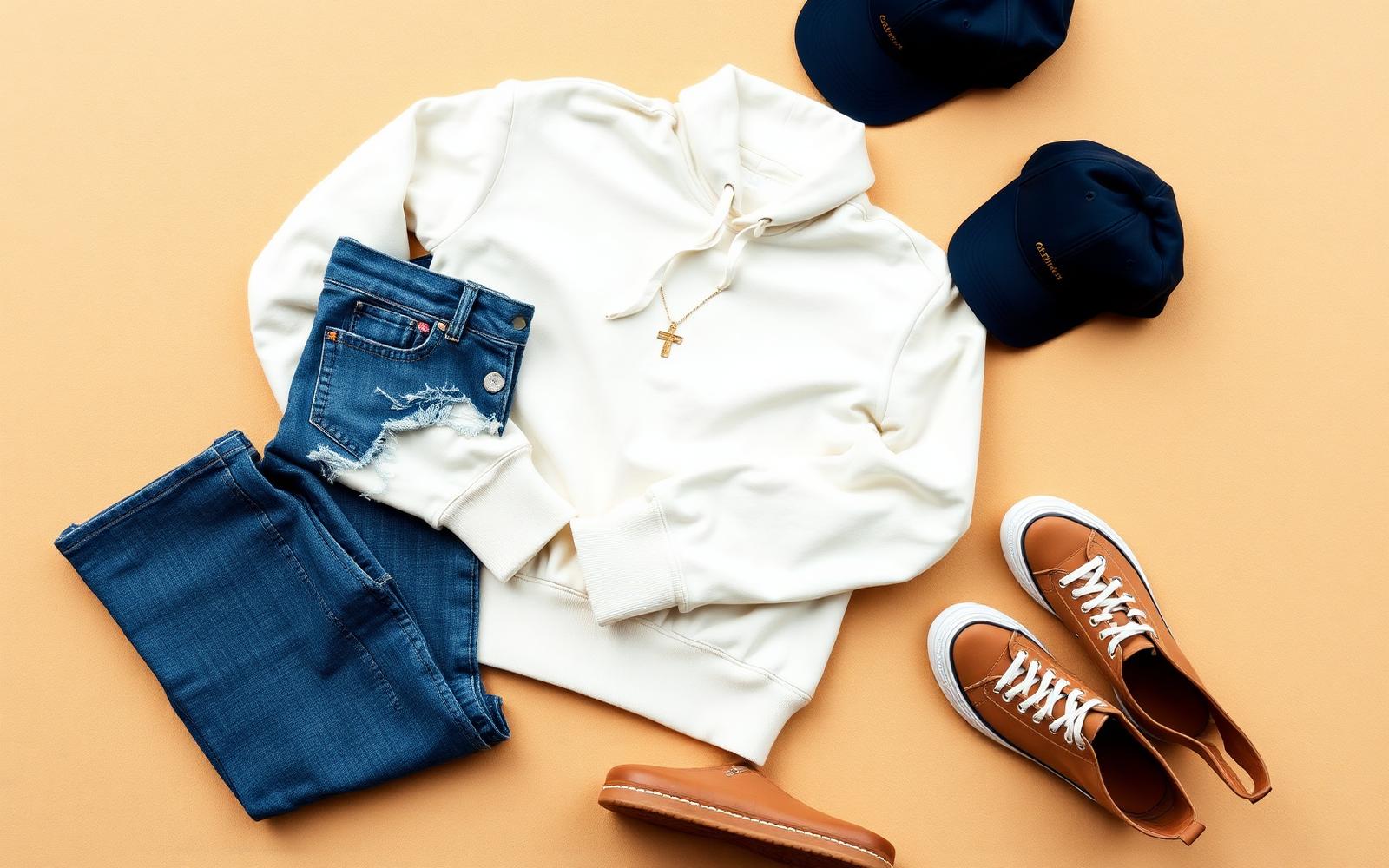
Style Guide
Six Ways to Style One Unspoken Feelings Hoodie
One hoodie, six outfits. A practical styling guide for getting more out of the piece you already reach for every week.
June 18, 2026 · 7 min read

Gifting
A Gift That Says It For You: Choosing Meaningful Gifts
Birthdays, hard seasons, quiet thank-yous. How to pick a gift that carries the sentence you can't quite say out loud.
July 2, 2026 · 6 min read
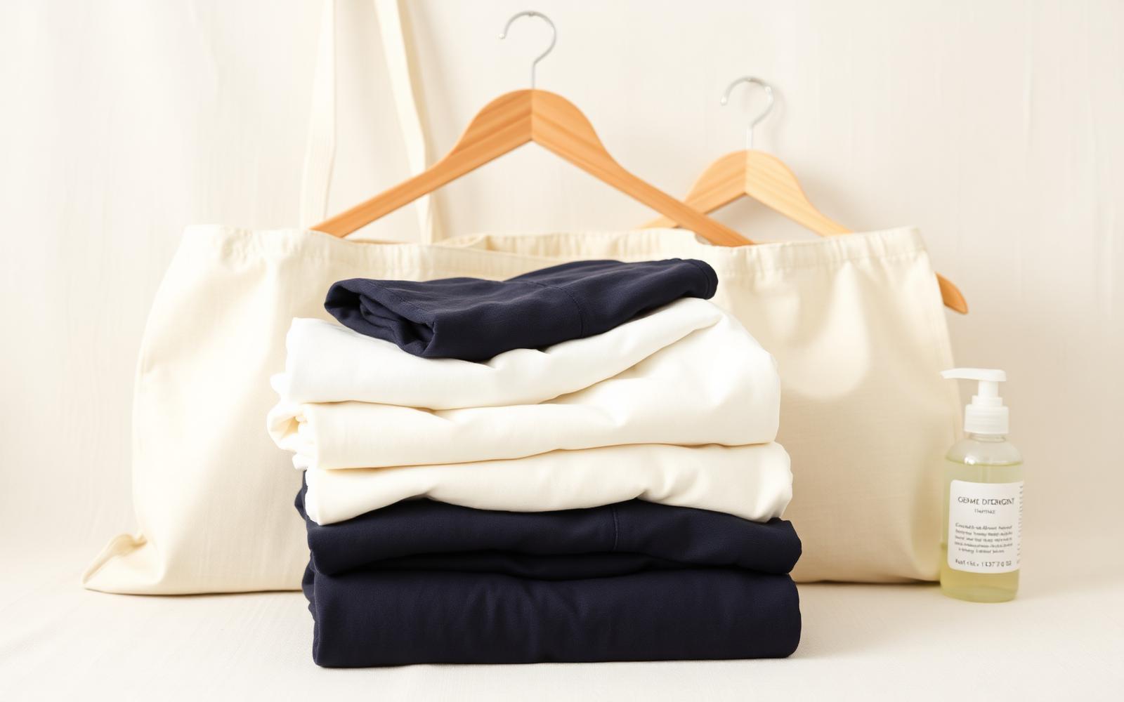
Care
Made to Last: Caring for Printed Tees, Hoodies and Totes
Printed cotton can look new for years — or fade in a month. The difference is about six small habits. Here they are.
July 16, 2026 · 6 min read